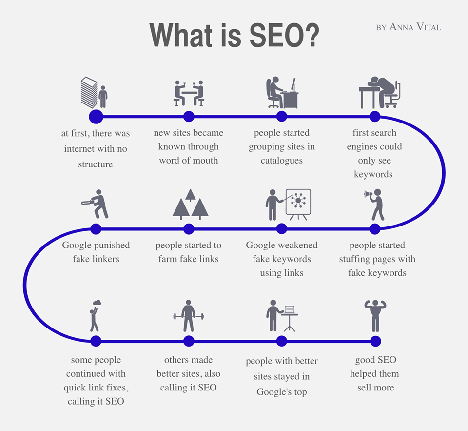
Can we learn a little more about the origins of #SEO? #Infographic #Google #Keywords
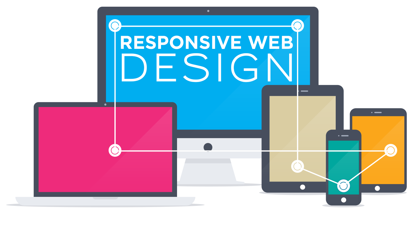
With Smartphones and Tablets proliferating in the market today, there is much more diversity than ever in the screen market.
With all these mobile devices, there is no doubt whatsoever about whether you need to have a website that is perfectly viewed from smartphones or tablets.
That is why there has been much talk lately about responsive web design. But what exactly is it? Responsive design is a web design trend that creates websites that can be perfectly seen on all kinds of devices, from desktop computers to smartphones to tablets. This way, you don’t need to worry about having to develop a website for each kind of device.
And how do they do this? Instead of building separate websites for each kind of device, a single website is created using intelligent CSS3 media queries and flexible layout and images. This way, the website detects from what kind of device the user is accessing, and shows a version of its contents that is optimized for that media (fewer and lighter images, columns layout rearranged, fewer text…). HTML5 enables an optimal experience for users, and without the cost of developing a native app for every device.